


The personalized gifts space was saturated to the point where brand and customer loyalty was limited to merely a discount being offered. With an expression reflective of holiday drive times rather core differentiators, Shutterfly was in a race for higher discounts to retain customers. Not to mention, without a brand that stood for the importance of memories, business performance was at the mercy of sales and specific events rather than a lifestyle brand it had hoped to be.
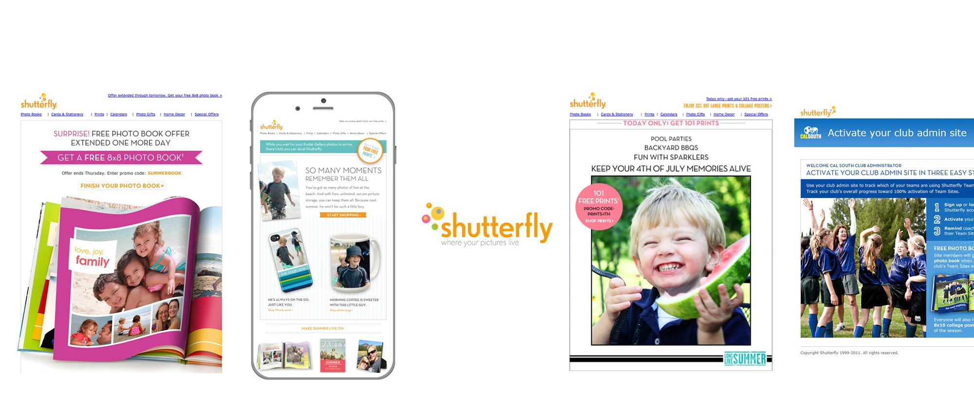
When Shutterfly was founded in 1999, the company was all about digital prints; more than a decade later, it’s evolved into a business that’s about more than photography. With the development of photo books, personalized cards, photo gifts, home decor and share sites, the company realized it was now in the business of people’s memories and stories. It needed a brand identity to match the company’s mission and values. Shutterfly put a stake in the ground about what it truly stood for; what emerged is “Your life’s stories. Your way.” This idea of transforming memories into something to be enjoyed and celebrated required a new look and a new voice. The brand refresh began with a new logo, a new creative strategy and a new way of talking to customer and from the Shutterfly ignite color emerged and a new brand book, website and packaging. It’s a modern, energetic look with marketing collateral that reflects the company’s commitment to innovation and the creative strategy placed the focus on the customer’s memories and stories.
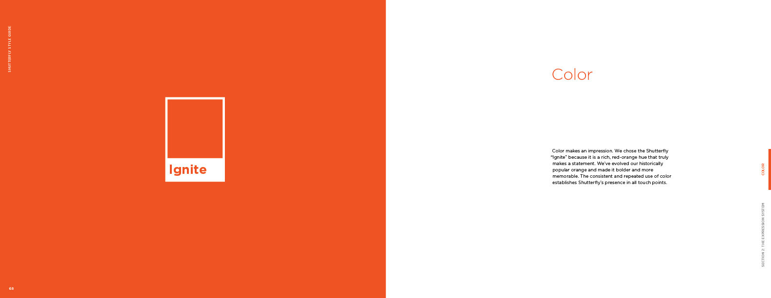
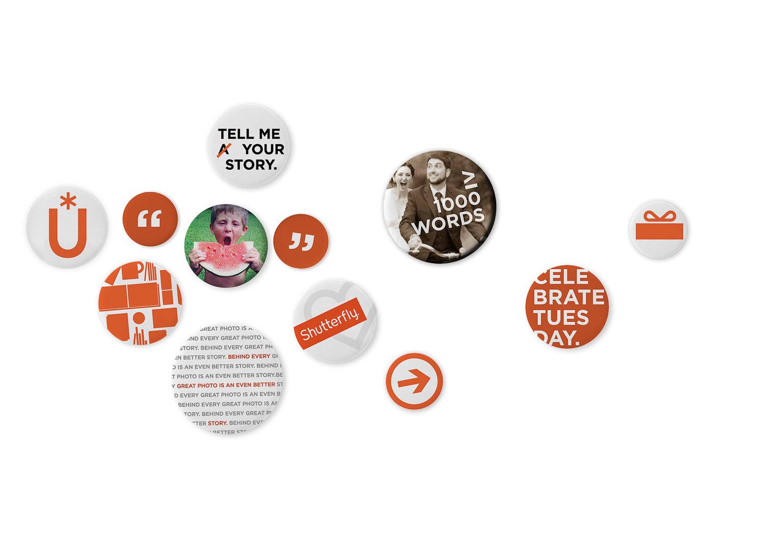
One of the non-negotiables was color (“Keep the orange”). OK, but WHAT orange?! Knowing through user testing that there was an emotional resonance to seeing the orange box on customer’s doorsteps (and what was inside), we choose an orange that would not only spark brand recognition to long time customers, but also reflect an updated energy that could “ignite” the emotion behind their memories…
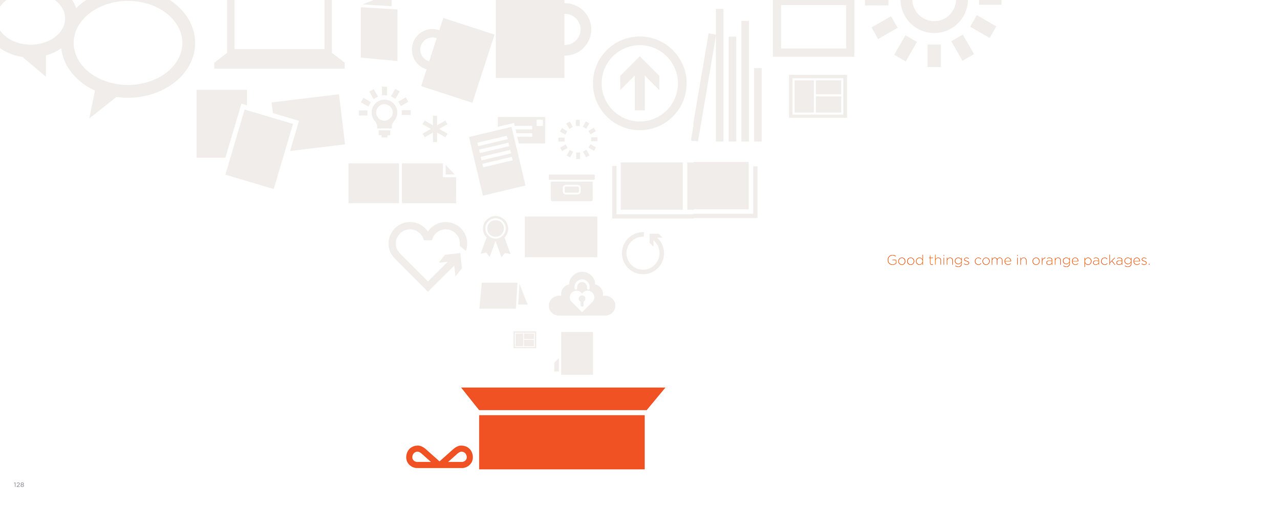
If customers LOVED seeing the orange box arrive at their door, then can the identity be an orange box? After all, good things come in orange packages, right?
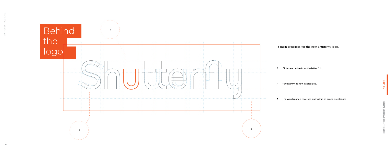
With a custom wordmark literally created from the letter “u” (you), a new identity was born. An orange box serves as the platform for the experience, while, from a tactical standpoint, the logo creates a natural stay-away for easier application.
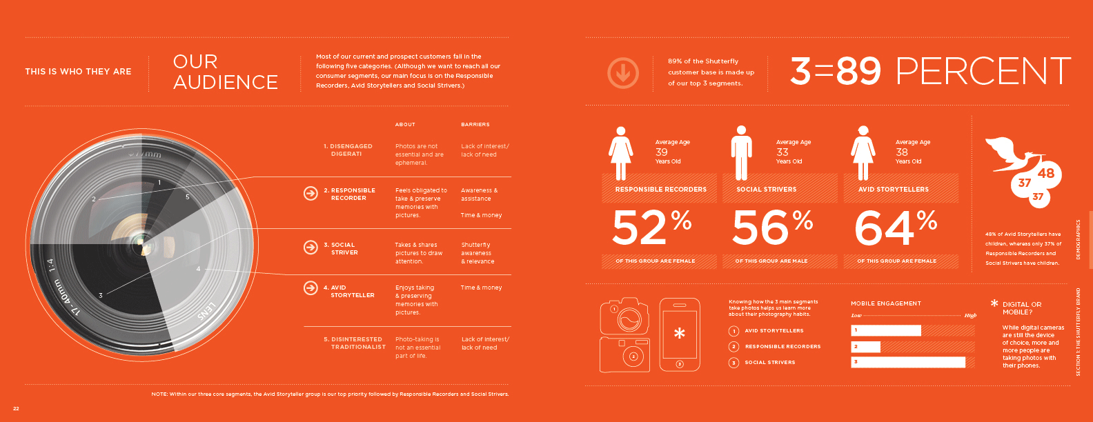
I’m sure at some point no one will actually know what the image on the left is (it’s a lens:)), but the Shutterfly expression had to take into account quantitative and qualitative data, to help inform not just what we’d create, but where to focus (get it?) our energy with regards to specific touchpoints through the experience.
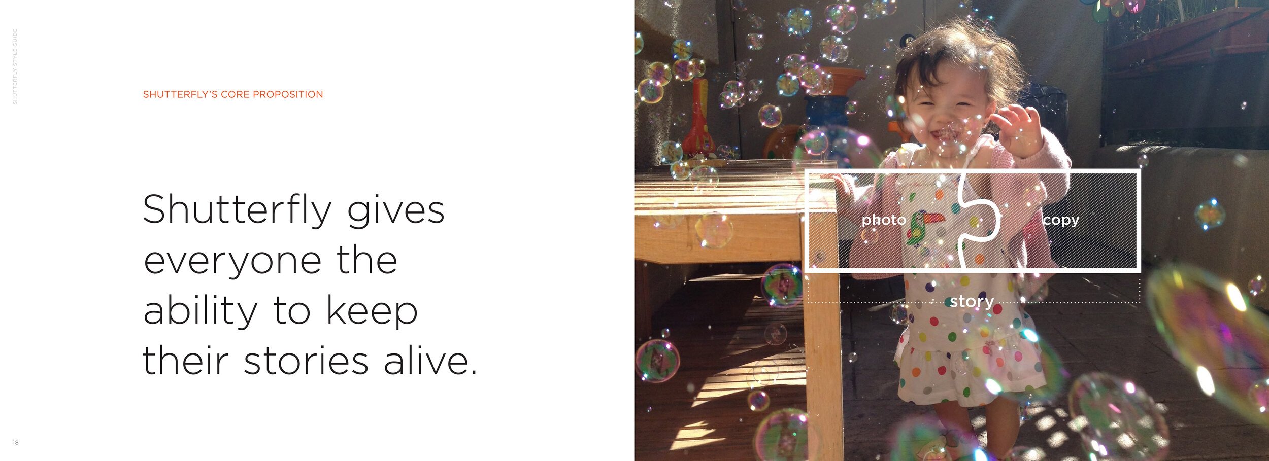
The rallying cry to our customers was actually the same as the rallying cry to our internal audience. Think about the story you want to tell, and tell it with all the tools at your fingertips- your way.
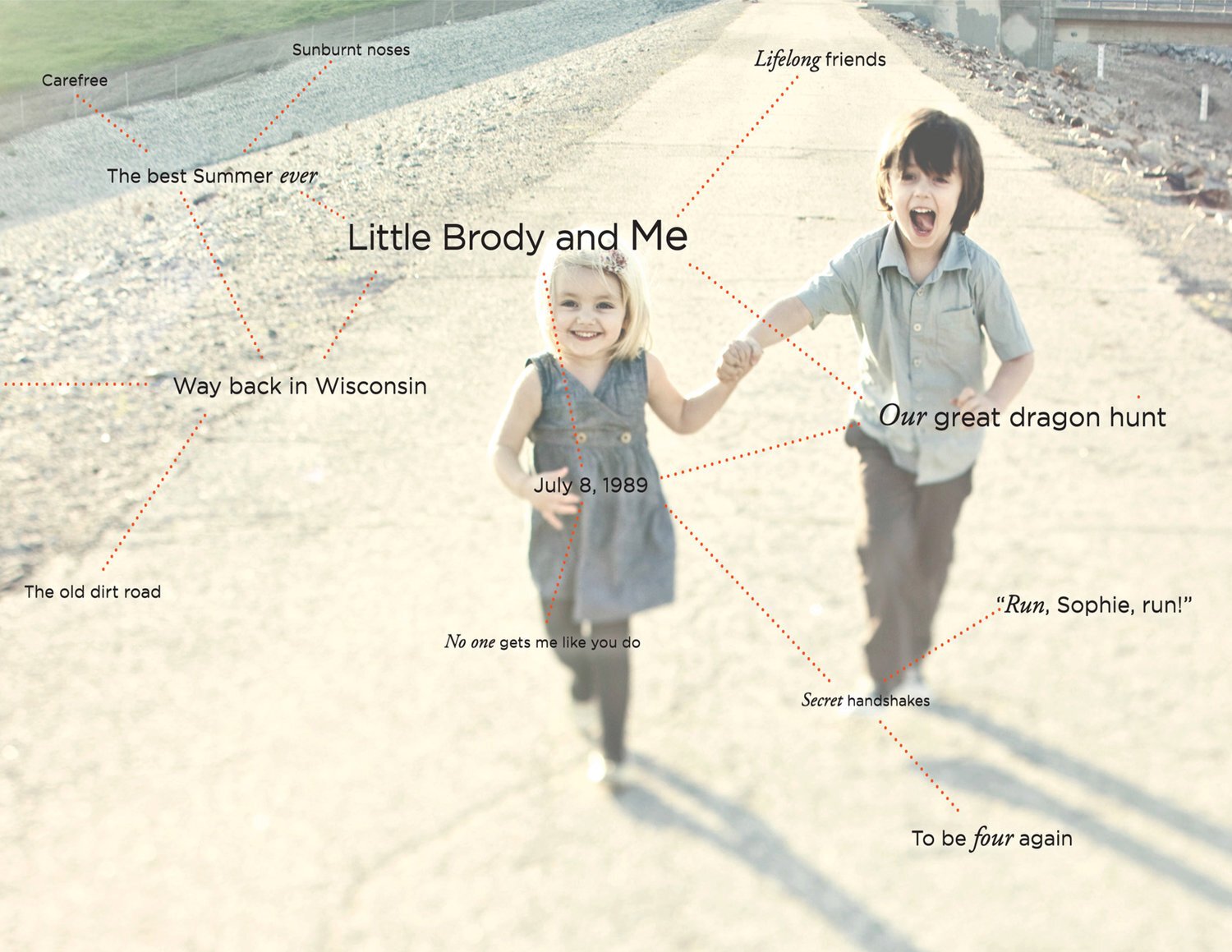
The perfect photo is the one that means the most to you. The photography strategy embraced an eclectic mix of styles, formats and even resolution. You don’t have to be a professional phototog to connect to the memory behind it.
Because of its growing list of email subscribers and app users with a high rate of engagement, the rebrand needed to flex into a variety of mobile strategies- from editorial, to promotional, to product creation through the new Shutterfly app. A strong emphasis on copywriting, voice and tone helped elevate the expression beyond its direct response marketing roots.
Living the Shutterfly brand meant establishing a company architecture where Shutterfly Inc., the parent brand, could evoke a sense of place while leaving flexibility for sub-brands to coexist as part of their growth strategy.
A strong system and internal education needed to be implement to rally employees around the notion that there was one brand in Shutterfly Inc. everyone worked FOR, regardless of what brand you worked ON.